
The symbol with smooth and, at the same time, strong
image represents the orientation to the future. It shows
Kumho E&C's enterprising and future-oriented spirit, and
the will to become a beautiful company flying to the future
with its customers.
The symbol color KC Red represents tradition and history
of Kumho E&C, and its power, energy and passion.
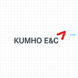
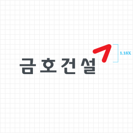
The logotype looks reliable and robust, and when used
with the symbol, will provide a more robust image.
The wordmark is designed to present an image of
robustness and when used with the symbol, will even
add the sturdiness. The Korean wordmark provides a
refined and original beauty of the Korean font.
-
-
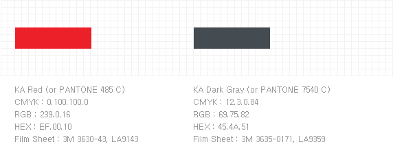
KC Red
CMYK : 0, 100, 100, 0
RGB : 239, 0, 16
-
KC Gray
CMYK :0, 0, 0, 70
RGB : 110, 110, 110
-
KC Beige
CMYK : 0, 0, 7, 20
RGB : 210, 210, 199
-
KC White
CMYK : 0, 100, 100, 0
RGB : 255, 255, 255
-
KC Red
-
Symbol Mark
-
Logotype

-
Brand Slogan

-
Signature
-
Brand Color
-
Primary Color
ARTERA Navy
PANTONE 2766 C
C 100 M 95 Y 37 K 24
R 36 G 42 B 92
HEX - #242A5C -
ARTERA Orange
PANTONE 2018 C
C 0 M 62 Y 83 K 0
R 244 G 127 B 63
HEX - #F47F3F -
ARTERA Light Pink
PANTONE 7422 C
C 0 M 22 Y 13 K 0
R 250 G 206 B 202
HEX - #FACECA -
ARTERA Sky Blue
PANTONE 277 C
C 22 M 6 Y 0 K 0
R 193 G 218 B 242
HEX - #C1DAF2 -
White
C 0 M 0 Y 0 K 0
R 255 G 255 B255
HEX - #FFFFFF -
ARTERA Beige
PANTONE 482 C
C 2 M 14 Y 24 K 2
R 240 G 213 B 186
HEX - #F0D5BA -
Black
C 0 M 0 Y 0 K 100
R 0 G 0 B 0
HEX - #000000
-
Primary Color
-
Brand Platform
-
Brand Name

-
Brand Essence

-
Core Values
-
Brand Slogan

-
Brand Name


